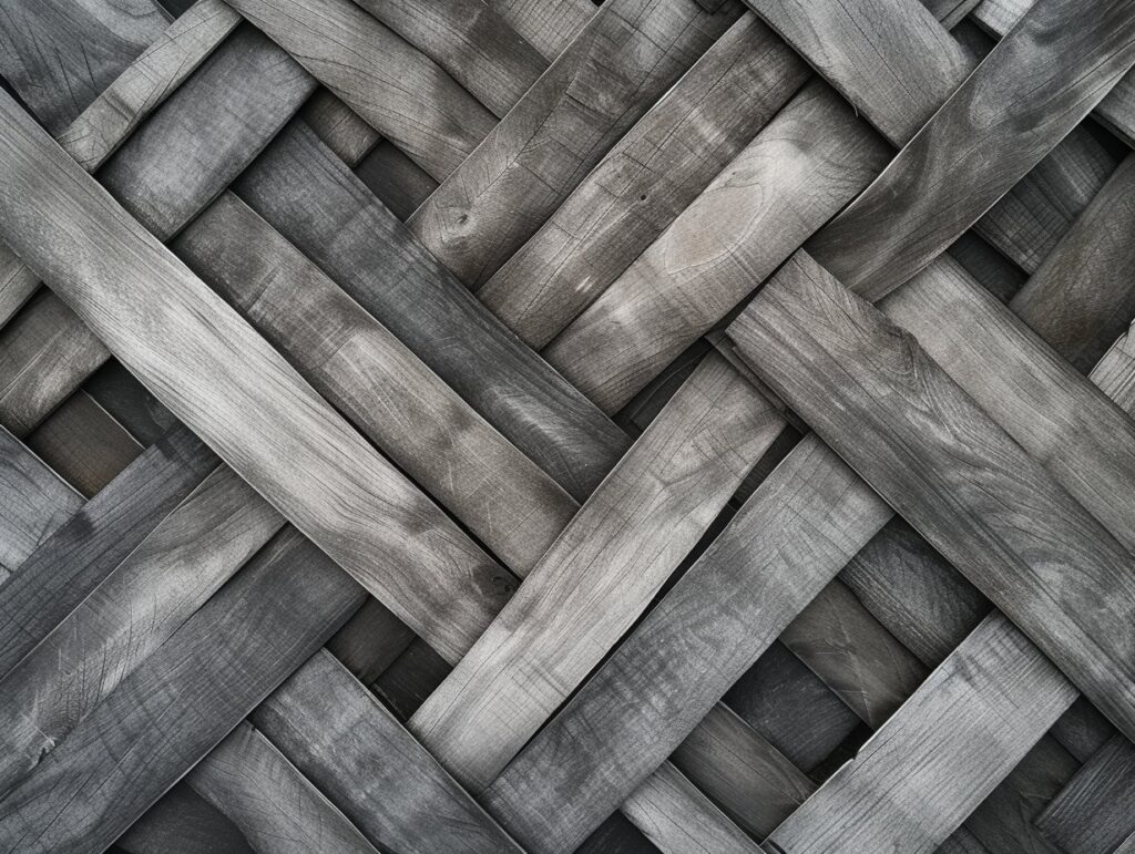
Gray is a versatile color that can be used in a variety of design projects. It is often associated with sophistication and stability, and is a popular choice for branding and website design. But what does the color gray mean, and how can it be used effectively in design projects?
The meaning of gray
Gray is a neutral color that is often associated with balance, composure, and sophistication. It is a color that is neither warm nor cool, and is often used as a background or filler color in design projects. Gray can also be seen as a sign of compromise, as it is a blend of black and white, two opposing colors.
Gray in psychology
In psychology, gray is often associated with feelings of sadness, boredom, and apathy. It is not a color that is typically associated with strong emotions, which is why it is often used in a neutral or calming capacity. However, too much gray can also be associated with feelings of loneliness and isolation.
Symbolism of gray
Gray is often seen as a symbol of neutrality, and is used to represent balance and fairness. It is also often associated with intelligence, as it is a color that is often associated with formal attire and business settings.
Using gray in design
Gray can be a useful color to incorporate into your design projects, but it is important to use it in moderation. Too much gray can make a design feel dull and uninspired, while too little can make it feel unbalanced.
One way to use gray effectively is to pair it with bold, vibrant colors to create contrast. This can help to add visual interest to a design and make it more eye-catching. Gray can also be used as a background color to help other design elements stand out.
Overall, the color gray is a versatile and sophisticated choice for design projects. It can be used to create a sense of balance and neutrality, and is often associated with intelligence and stability. By understanding the meaning and symbolism of gray, you can use it effectively in your designs to create the desired impact.
Table of Contents
What Does the Color Gray Mean?
The color gray is a neutral color that is often associated with balance, composure, and sophistication. It is a blend of black and white, two opposing colors, and is often seen as a symbol of neutrality and compromise. Gray is not a color that is typically associated with strong emotions, which is why it is often used in a neutral or calming capacity. In design projects, it is often used as a background or filler color to create a sense of balance and calm. However, too much gray can also be associated with feelings of loneliness and isolation, and it is important to use it in moderation in order to avoid these negative connotations.
The Psychology of the Color Gray
In psychology, the color gray is often associated with feelings of sadness, boredom, and apathy. It is not a color that is typically associated with strong emotions, and is often seen as a neutral or calming color. However, too much gray can also be associated with feelings of loneliness and isolation, as it is a color that can be seen as dull and uninspiring. It is important to use gray in moderation in order to avoid these negative connotations and create a balanced and positive emotional impact.
Gray can be a useful color to incorporate into design projects, particularly in situations where a neutral or calming effect is desired. For example, it may be used in the design of a healthcare facility or a relaxation app to create a sense of tranquility and calm. However, it is important to consider the emotional impact of the color and use it in combination with other colors in order to avoid a dull or uninspiring design.
The Symbolism of the Color Gray
The symbolism of the color gray is often tied to its associations with neutrality, balance, and compromise. It is a blend of black and white, two opposing colors, and is often seen as a neutral color that sits between the two. As a result, it is often associated with fairness and impartiality, and is used to represent balance and stability.
Gray is also often associated with intelligence and formality. It is a color that is commonly associated with business settings and formal attire, and is seen as a sophisticated and professional color choice.
In design projects, the symbolism of gray can be used to create a sense of balance and neutrality, or to convey a sense of intelligence and professionalism. It is important to consider the desired symbolism and impact of the color when incorporating it into a design, and to use it in combination with other colors in order to create the desired effect.
Using Gray in Design Projects
Gray is a versatile color that can be used in a variety of design projects, but it is important to use it in moderation in order to avoid a dull or uninspired design. One effective way to use gray in design is to pair it with bold, vibrant colors in order to create contrast and add visual interest to the design. Gray can also be used as a background color to help other design elements stand out and create a sense of balance.
In addition to its aesthetic uses, gray can also be used to create a specific emotional impact in design projects. As a neutral color, it is often associated with feelings of calm and tranquility, and can be used in the design of healthcare facilities or relaxation apps to create a soothing atmosphere. However, it is important to consider the potential negative connotations of too much gray, such as feelings of sadness or boredom, and to use it in moderation in order to avoid these associations.
Overall, the key to using gray effectively in design is to consider the desired impact and symbolism of the color, and to use it in combination with other colors in order to create a balanced and visually appealing design.
Gray as a Neutral Background Color
Gray is a neutral color that is often used as a background or filler color in design projects. It can be an effective choice for creating a sense of balance and calm in a design, and can help other design elements stand out.
One way to use gray as a background color is to pair it with bold, vibrant colors in order to create contrast and add visual interest to the design. This can be particularly effective in website design, where the use of a gray background can help to make text and other elements more legible and easier to read.
Gray can also be used as a background color in more minimalist design projects, where it can help to create a clean and uncluttered look. In these cases, it is important to consider the potential negative connotations of too much gray, such as feelings of sadness or boredom, and to use it in moderation in order to avoid these associations.
Overall, using gray as a background color can be an effective way to create a sense of balance and neutrality in a design, and can help to make other design elements stand out. It is important to consider the desired impact and symbolism of the color, and to use it in combination with other colors in order to create a balanced and visually appealing design.
Pairing Gray with Vibrant Colors
Pairing gray with vibrant colors can be an effective way to use the color in design projects and add visual interest to the design. Gray is a neutral color that can help to tone down and balance out bold, vibrant colors, creating a harmonious and visually appealing design.
For example, using a bright and bold shade of red against a gray background can create a striking and eye-catching design, while still maintaining a sense of balance and sophistication. Similarly, pairing a bright yellow with gray can create a cheerful and energetic design, while still maintaining a sense of professionalism.
It is important to consider the symbolism and emotional impact of the colors being paired with gray, and to use them in a way that creates the desired overall effect. For example, pairing gray with softer, pastel shades of color can create a calming and soothing design, while pairing it with bright and bold shades can create a more energetic and attention-grabbing design.
Overall, pairing gray with vibrant colors can be an effective way to add visual interest to a design and create a balanced and harmonious overall aesthetic.
The Associations of Gray with Intelligence and Stability
Gray is often associated with intelligence and formality, and is a color that is commonly associated with business settings and formal attire. As a result, it is often seen as a sophisticated and professional color choice, and is frequently used in branding and website design for this reason.
Incorporating gray into a design can help to convey a sense of intelligence and professionalism, and can be particularly effective when used in combination with other formal or business-oriented design elements, such as serif fonts or clean, minimalist layouts.
It is important to consider the desired impact and symbolism of the color when incorporating it into a design, and to use it in moderation in order to avoid a dull or uninspiring design. Pairing gray with other colors, such as bold or vibrant shades, can also help to add visual interest to the design and create a balanced overall aesthetic.
Overall, the associations of gray with intelligence and formality make it a popular choice for business-oriented design projects, and can help to convey a sense of sophistication and professionalism.
The Role of Gray in Creating Balance and Neutrality
The color gray is often associated with balance and neutrality, and is often used in design projects in order to create a sense of calm and tranquility. It is a blend of black and white, two opposing colors, and is seen as a neutral color that sits between the two. As a result, it is often used to represent fairness and impartiality, and is used to create a sense of balance and stability in design projects.
Gray can be an effective choice for creating a sense of neutrality in design projects, particularly when used in combination with other neutral colors such as beige or white. It can also be paired with bold or vibrant colors in order to create contrast and add visual interest to the design, while still maintaining a sense of balance and neutrality.
It is important to consider the desired impact and symbolism of the color when incorporating it into a design, and to use it in moderation in order to avoid a dull or uninspiring design. Using gray in combination with other colors can also help to create a balanced and harmonious overall aesthetic.
Overall, the associations of gray with balance and neutrality make it a popular choice for creating a sense of calm and stability in design projects.
The Negative Connotations of Too Much Gray
While the color gray can be an effective choice for creating a sense of balance and neutrality in design projects, it is important to use it in moderation in order to avoid negative connotations. Too much gray can make a design feel dull and uninspiring, and can be associated with feelings of sadness, boredom, and apathy.
In order to avoid these negative connotations, it is important to use gray in moderation and to pair it with other colors in order to create contrast and add visual interest to the design. Using a variety of shades of gray can also help to add depth and dimension to a design, and can help to prevent it from feeling monotonous or flat.
It is also important to consider the overall emotional impact of the design, and to use color in a way that creates the desired effect. In cases where a calming or soothing effect is desired, using gray in combination with softer, pastel shades can create a relaxing and peaceful aesthetic.
Overall, it is important to use gray in moderation in order to avoid negative connotations and create a balanced and visually appealing design.
Incorporating Gray into Your Designs Effectively
Incorporating gray effectively into design projects requires an understanding of the meaning and symbolism of the color, as well as an awareness of its potential emotional impact. It is important to consider the desired impact and symbolism of the color when using it in a design, and to use it in moderation in order to avoid negative connotations such as feelings of sadness or boredom.
One way to use gray effectively is to pair it with bold, vibrant colors in order to create contrast and add visual interest to the design. Gray can also be used as a background color to help other design elements stand out and create a sense of balance. Using a variety of shades of gray can also help to add depth and dimension to a design, and can help to prevent it from feeling monotonous or flat.
It is also important to consider the overall emotional impact of the design, and to use color in a way that creates the desired effect. In cases where a calming or soothing effect is desired, using gray in combination with softer, pastel shades can create a relaxing and peaceful aesthetic.
Overall, understanding the meaning and symbolism of gray and using it effectively in combination with other colors can help to create a balanced and visually appealing design.
Explore the Meaning, Psychology, and Symbolism of the Color Black
Exploring the Psychological and Symbolic Meaning of Silver Color
Exploring the Meaning, Psychology, and Symbolism of the Gunmetal Color
Unlocking the Psychological and Symbolic Meaning of Ebony: A Comprehensive Guide
Discover the Meaning, Psychology, and Symbolism of Pewter Color
Discover the Meaning, Psychology, and Symbolism of Taupe Color